Zico: O Samurai de Quintino
Between Quintino and Kashima
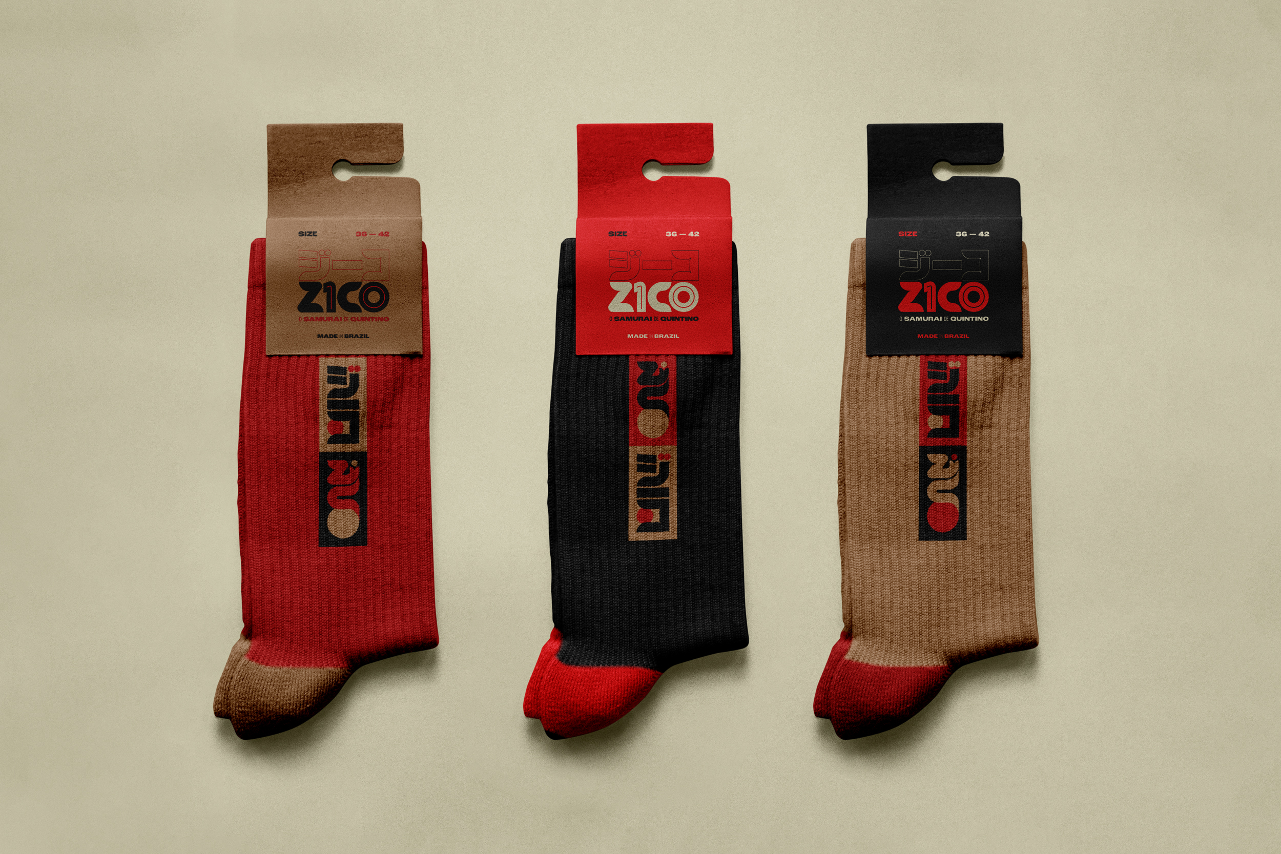
The visual identity for “Zico: O Samurai de Quintino” reads the athlete's trajectory as a travessia between Brazil and Japan through graphic language.
The project reads as a visual travessia, exploring the inherent tension between Brazilian fluidity and Japanese structure. It honors the distinct rhythms of Quintino and Kashima, translating a legacy into a cohesive graphic system.
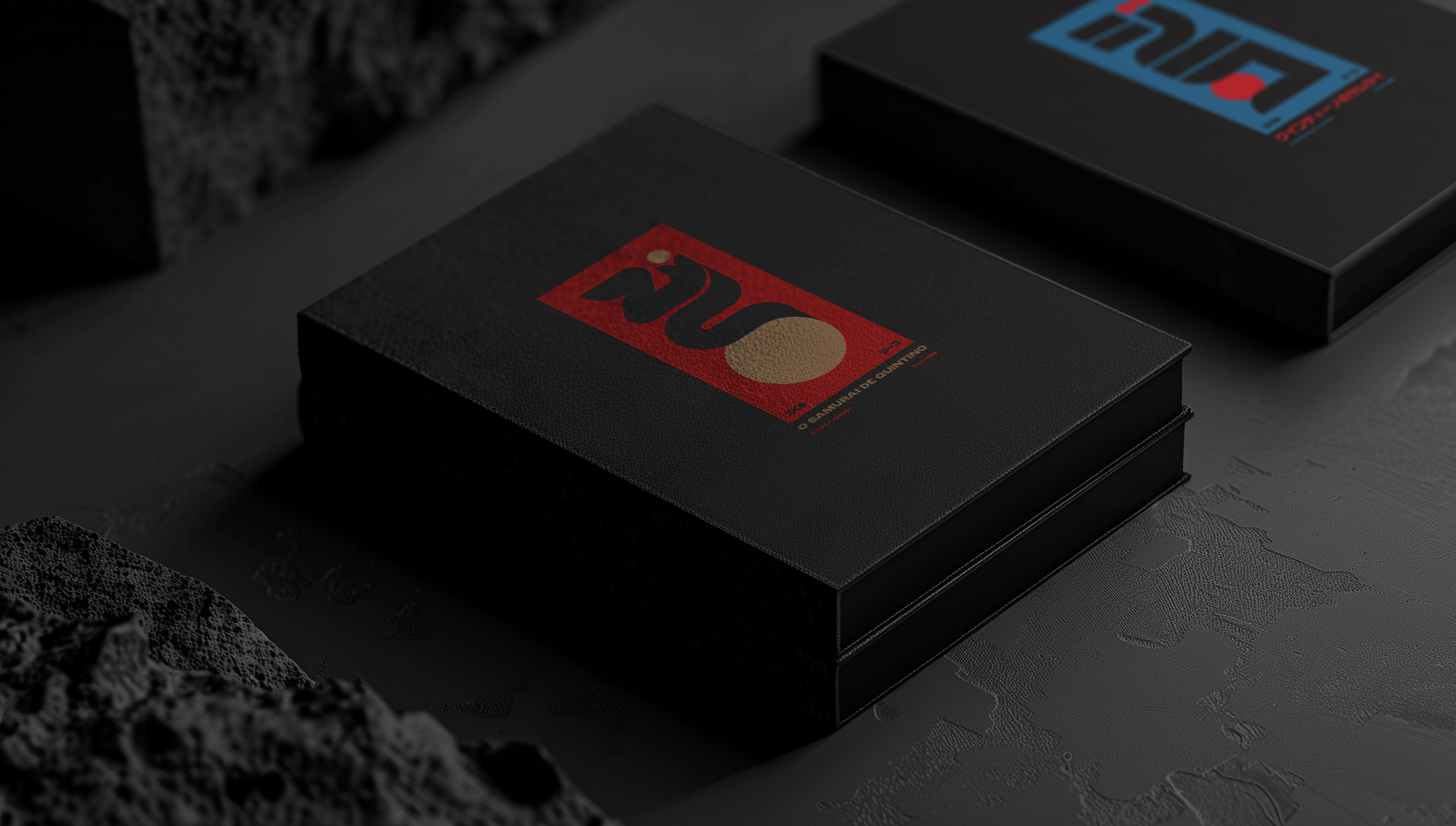
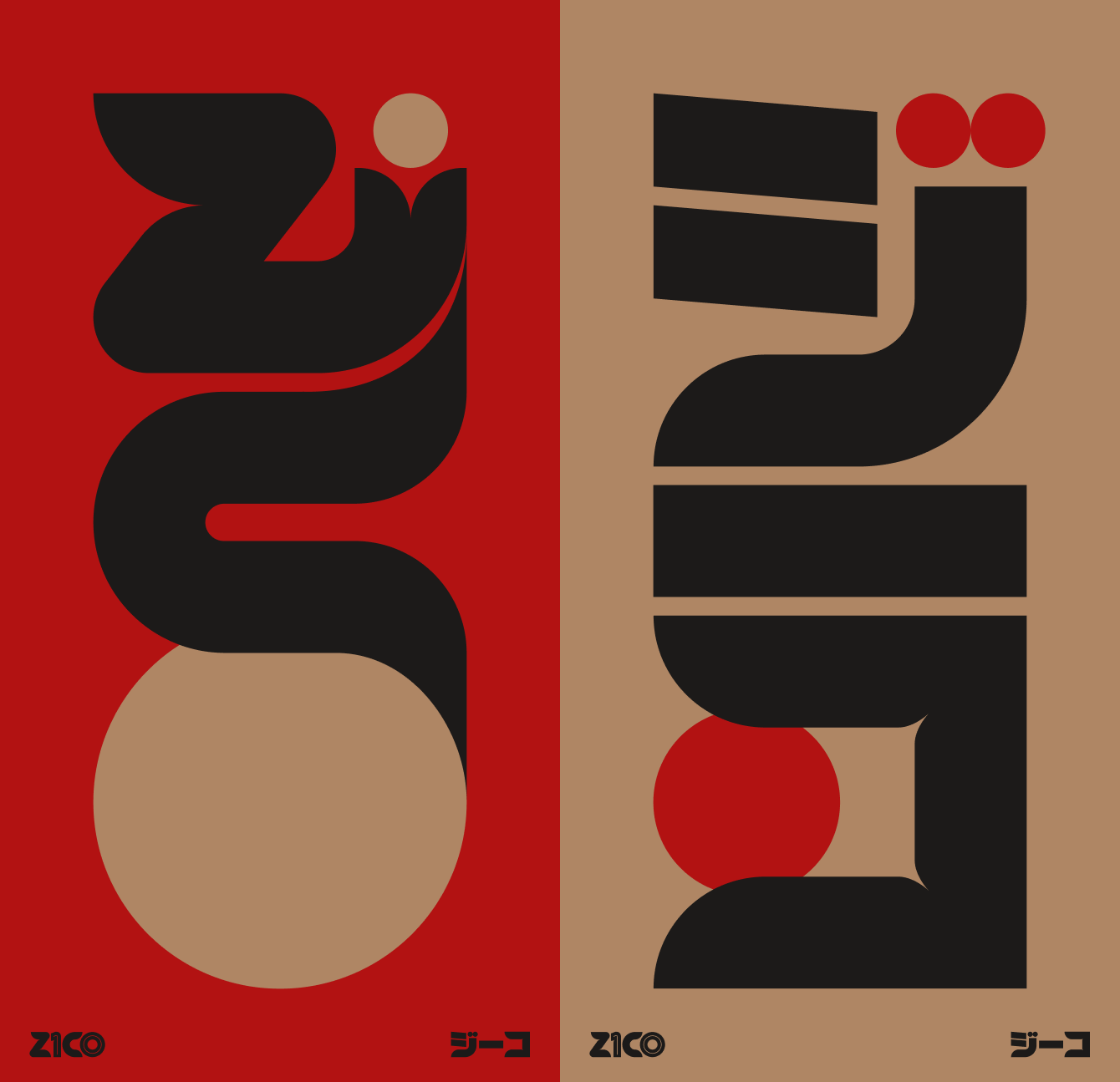
At the center of this visual language are two iterations of the primary mark, crafted in both Latin script and Katakana. These typographic forms share equal visual weight, alternating their protagonism across the film's surface. Drawing references from Japanese design of the 1980s and 1990s, the composition relies on flat colors and solid forms. This creates a continuous dialogue between bold structure and fluid movement.
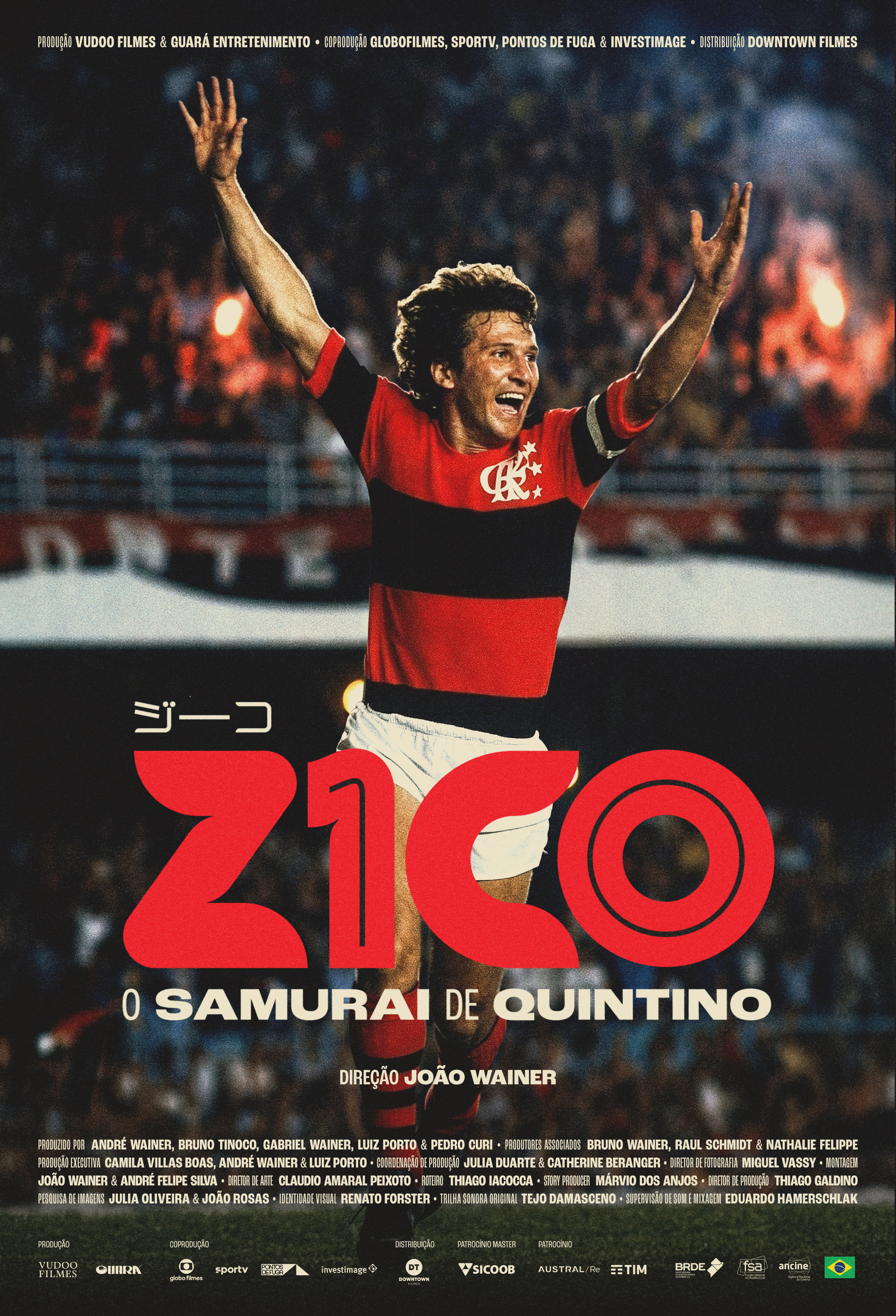
The color system acts as a historical archive. It juxtaposes the iconic black and red of Flamengo with the blue, red, and white of Kashima and Sumitomo. Binding these distinct palettes is the deliberate presence of gold, an homage to the Japanese art of Kintsugi. This material choice elevates the graphic language, reading as a symbol of resilience, transformation, and a quiet honoring of the scars inherent in an athletic journey.
Extending beyond the primary mark, the graphic system dictates the rhythm of the screen. Title cards, lower thirds, subtitles, and the montage of archival materials strictly adhere to this established language. Selected promotional pieces maintain this aesthetic intelligence, ensuring the original concept remains uncompromising and cohesive in every application.