
Luol Deng Foundation
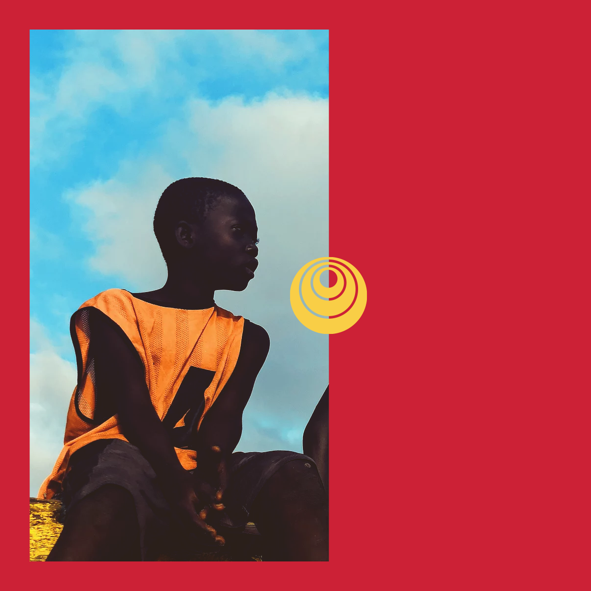
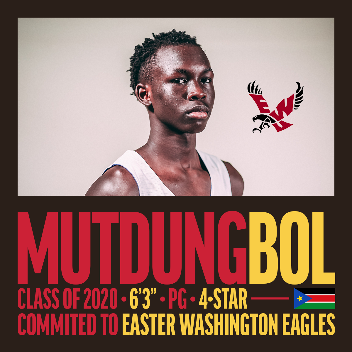
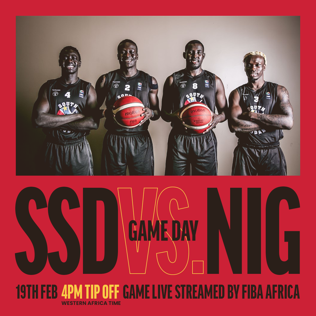
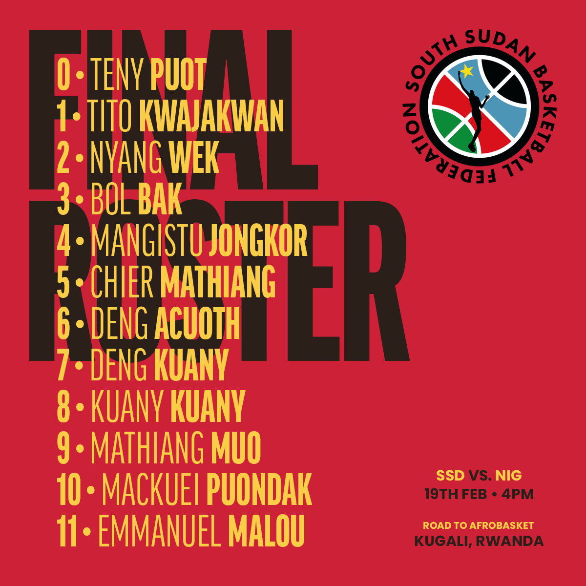
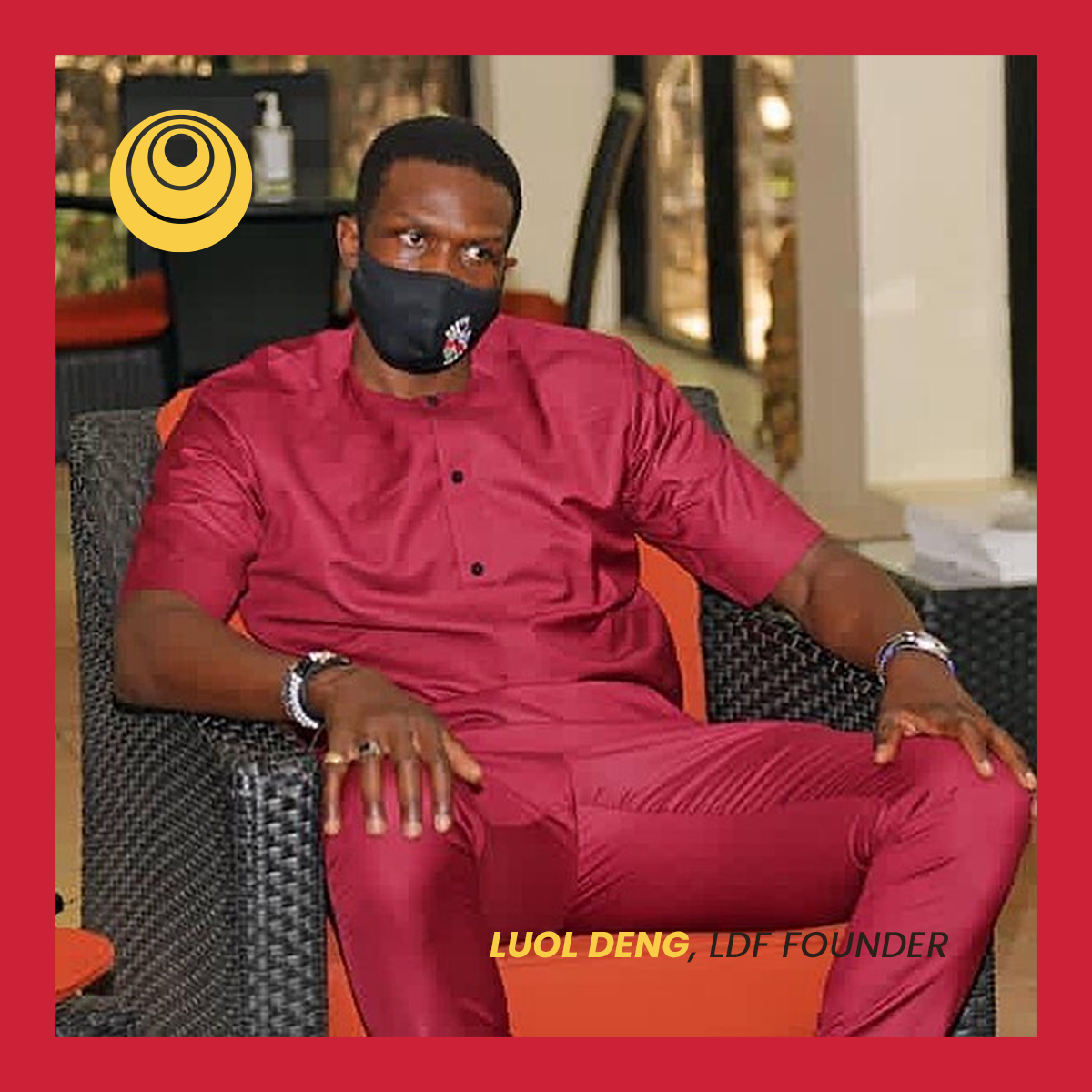
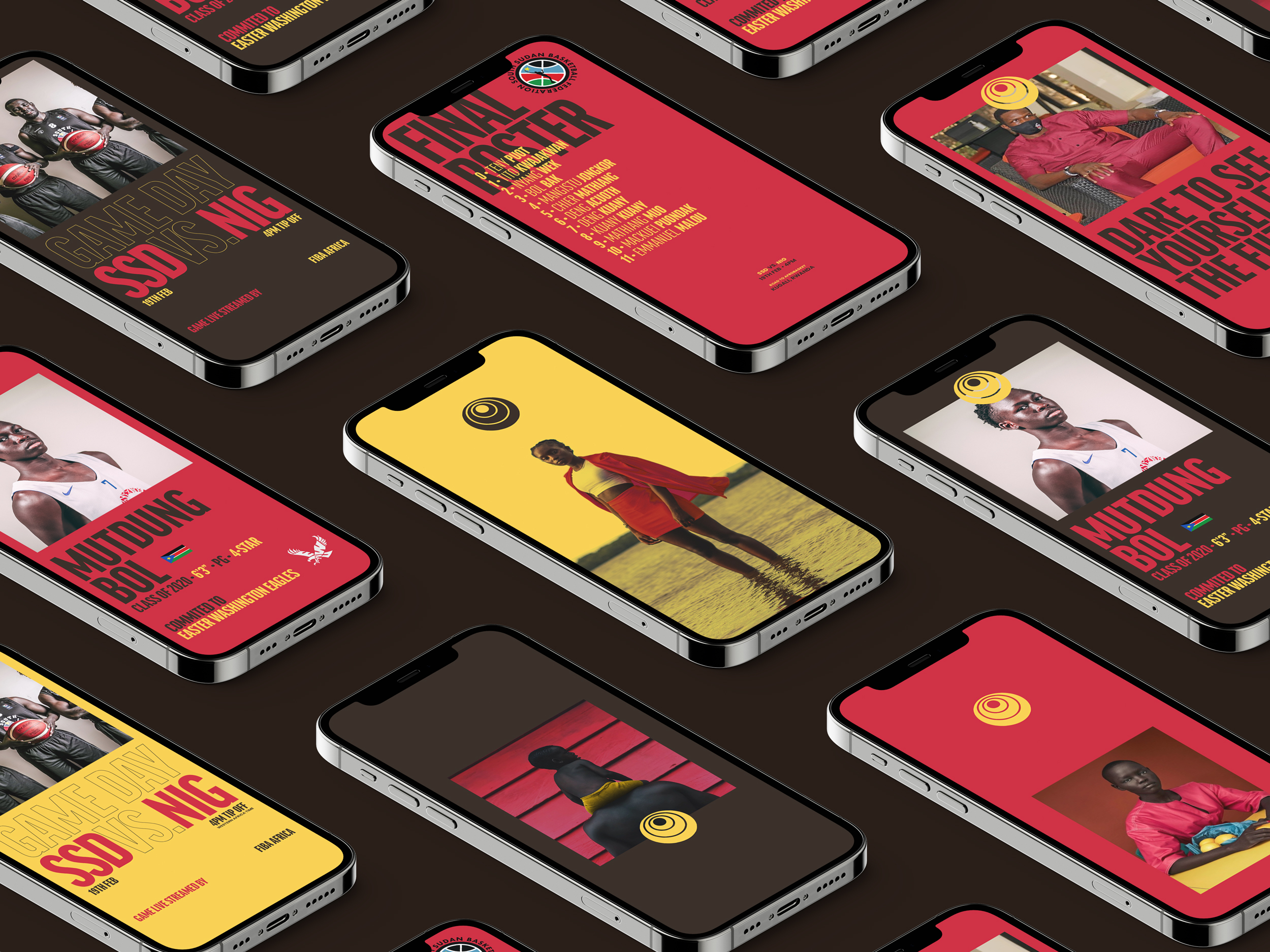
Brand identity for South Sudan and the USA. Young people as the driving force behind hope — a telescopic eye on the future, cattle horns, and the Chicago Bulls, held in red, yellow, and brown.
The inspiration
Young people are the driving force behind hope for better days. They choose to look forward, to design the unimaginable, to bet on dreams. They use the strength of their history and memories as the most potent fuel for their bodies and minds today and for the future.
It is through their eyes that many other people see new possibilities, a new time and a better world.
It's because of their gaze that we don't lose hope.





The "eyecon"
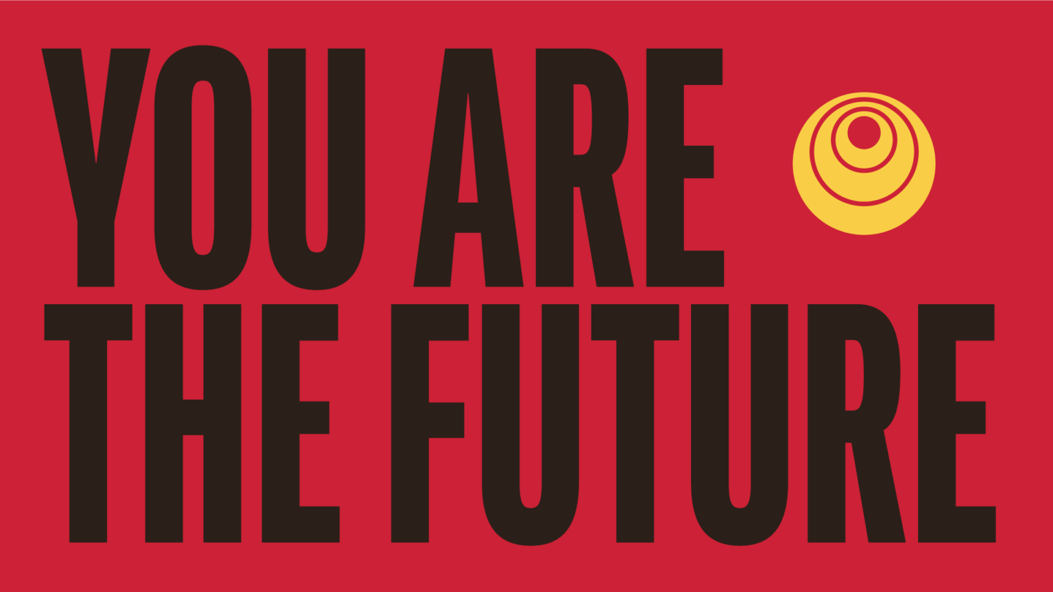
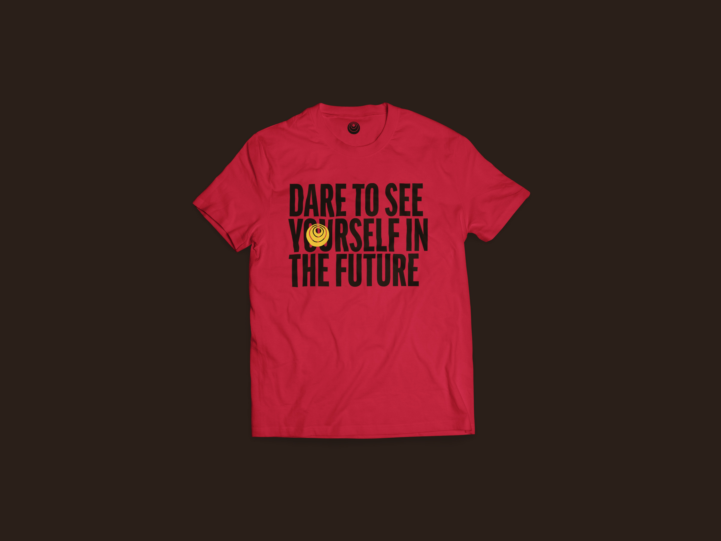
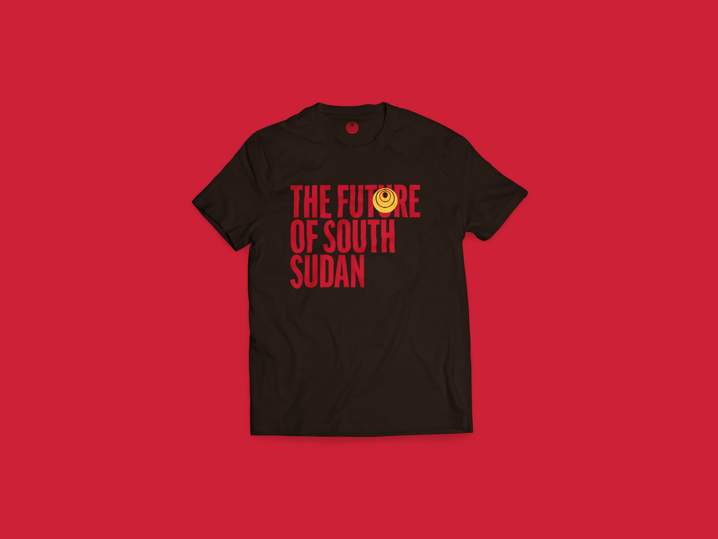
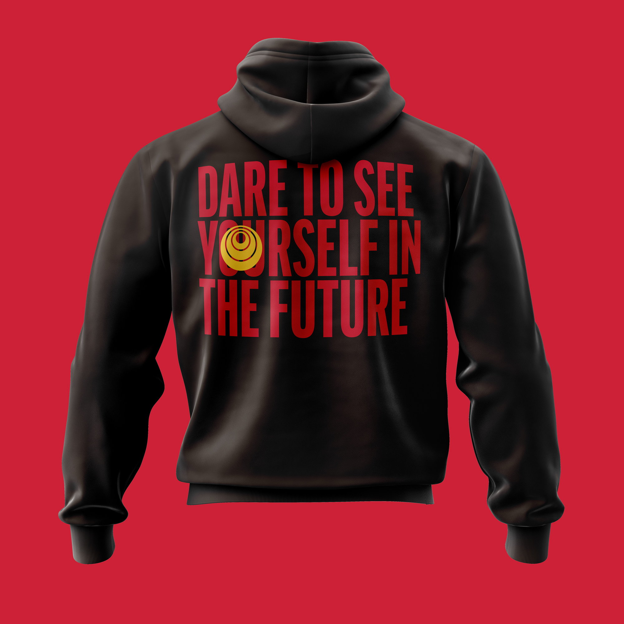
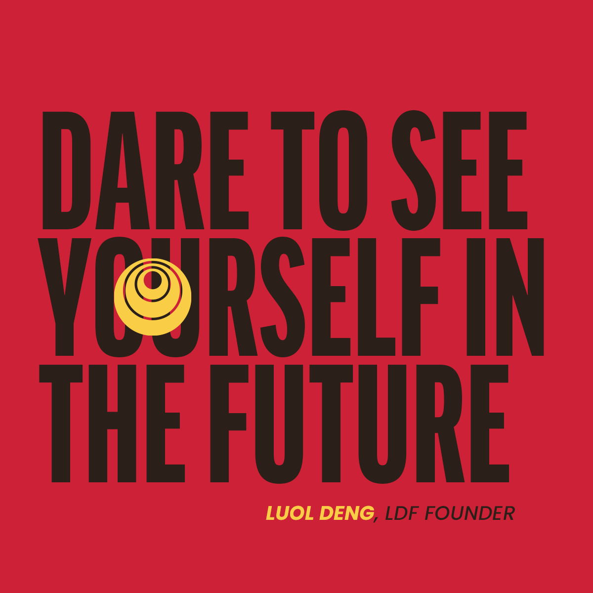
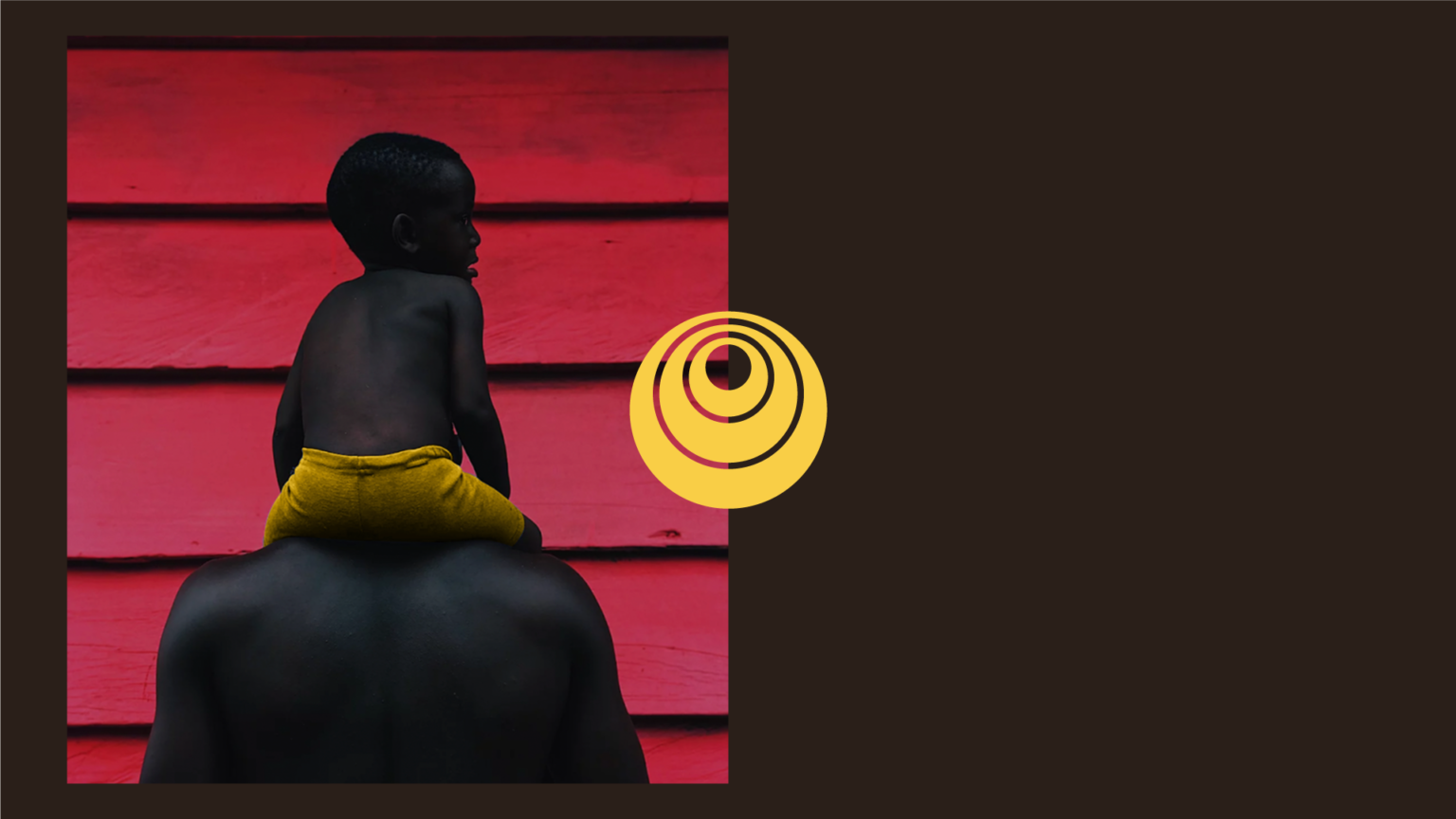
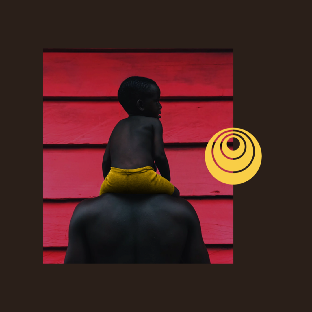
The icon represents a telescopic eye on the future, envisioning what we want to achieve. It is used together with typography to exalt the idea of looking ahead, at the new, for what can be built.
The circle in the center gives us the idea of something that we want to achieve in front of us, something that motivates us and makes us look ahead.
It also something that emanates energy. An energy that can positively affect those around you, and take us all to a better place.
In addition, the geometric shapes used in the logo references to the horns of cattle, so powerful in the Dinka culture and the Chicago Bulls, the heritage of the founder himself.
Logo construction
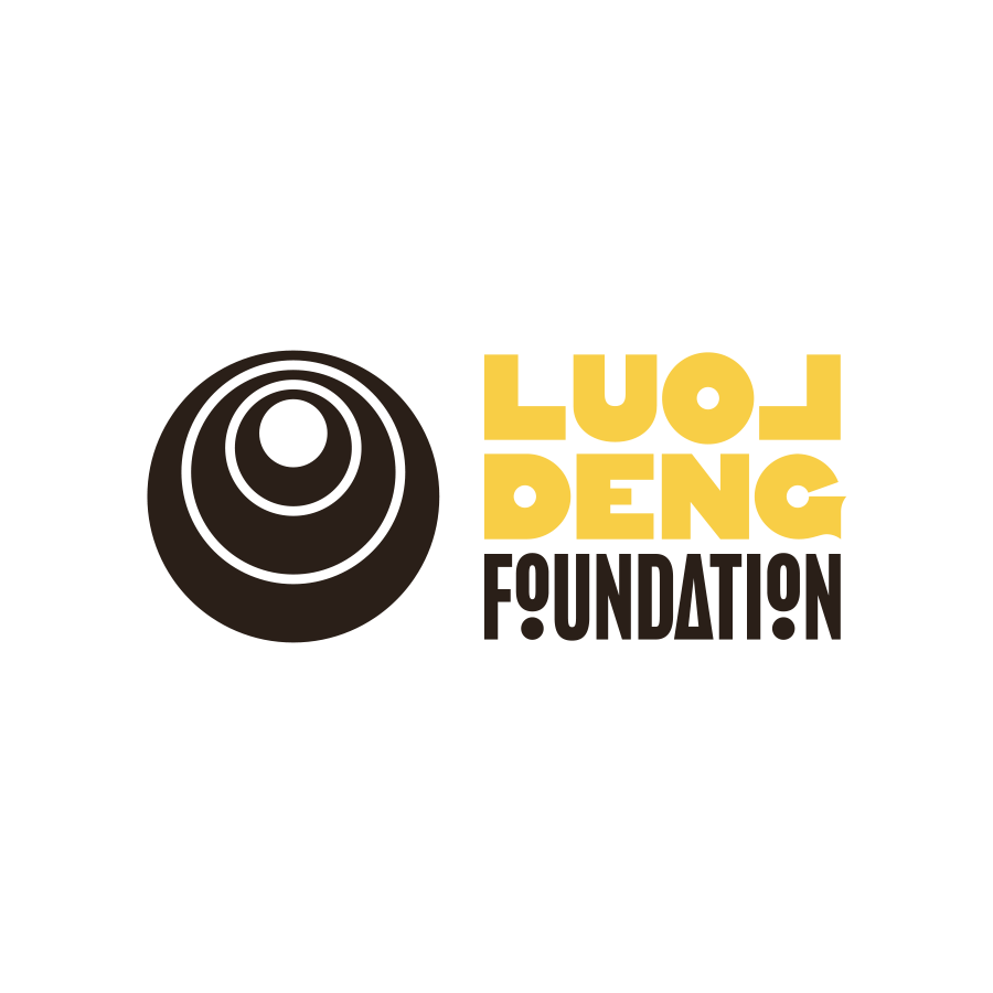
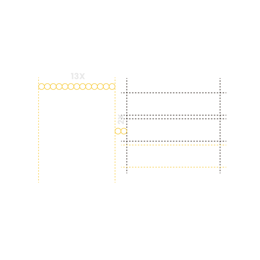
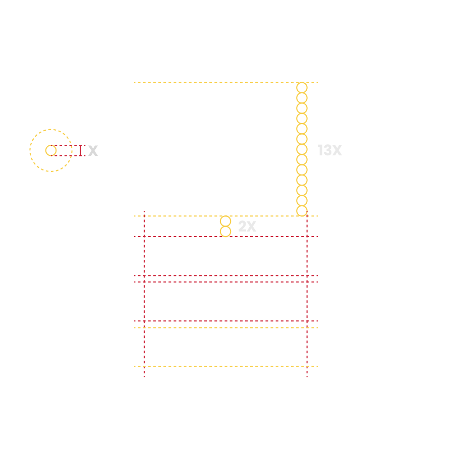
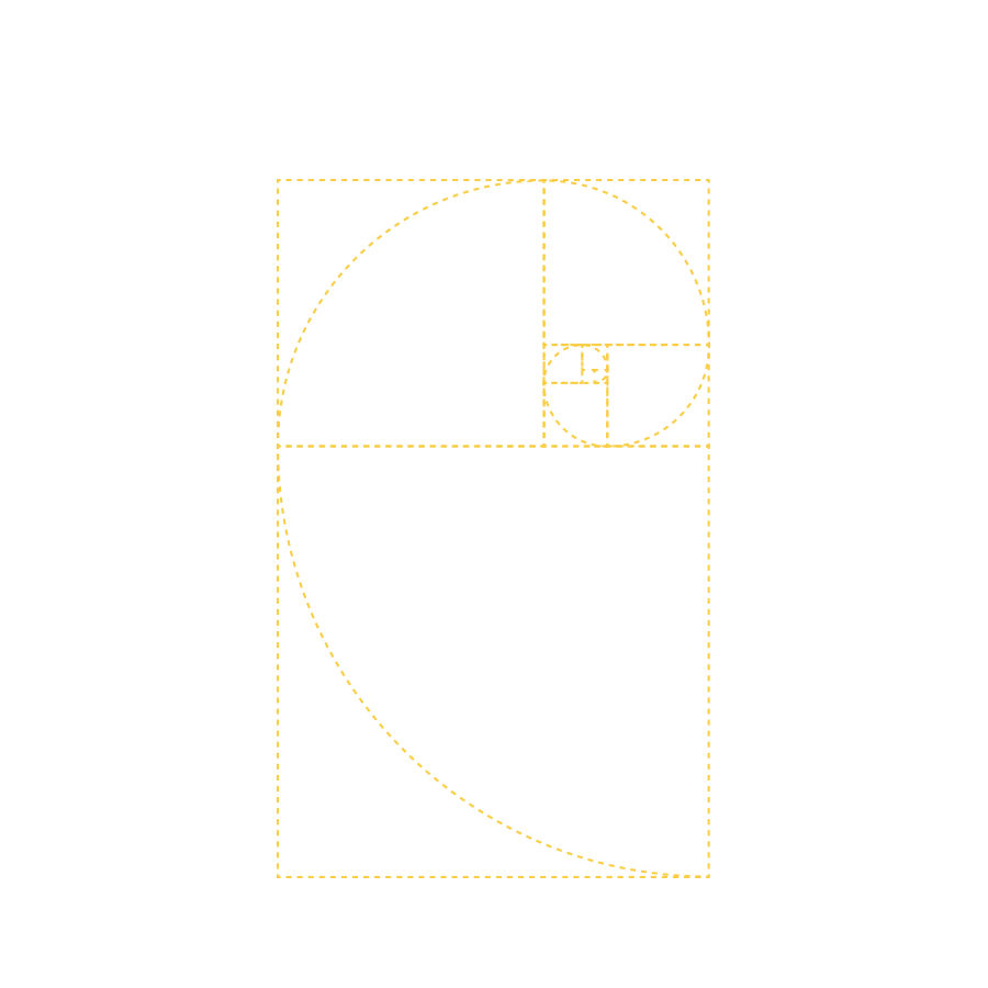
The perfect circles of the telescopic eye icon are represented in the letters O, D, and G typography so we have a sense of unity and connection between the elements.
It's also no secret that they nod to the shape of a basketball, part of the origins of this organization and an opportunity-creating tool for South Sudan.
The name Luol Deng appears with a typography that conveys strength and stability, with warm curves, inviting and giving a subtle nod to the basketball.
The word Foundationwas developed in a way to give more prominence to the base of the lockup and convey a sense of energy and movement. The two "o" letters are being dynamically raised or propelled upward, to a level above where they were before; a support system for transformation.

Slide 1 of 3